Alright folks, today I wanna share how I dug into what YMCA gear people actually like wearing. It started cause I volunteered to help our local branch pick new shirt designs, and honestly, I had no clue what would fly. Gotta make stuff people wanna wear, right?
Just Grabbing a Bunch of Designs First
First step? Get my hands on everything. Raided the storage room – old tees, hoodies, polos, hats… you name it. Was actually surprised how many different styles they’d tried over the years. Spread them all out on the big tables in the meeting room. Felt like I was running a mini thrift store in there. Took pictures of each one, front and back, good lighting. Had stacks of printed photos by the end. Little messy, but it worked.
Hitting the Ground to Actually Ask People
Didn’t wanna guess. Needed real talk. Every time I saw someone at the Y – waiting for their kid after swimming, grabbing coffee in the lobby, working out – I’d just ask nicely. “Hey, mind if I show you a few shirt designs? Tell me which ones grab you.” Simple. Carried those photos everywhere for a week.
Seeing What People Pointed To Over and Over
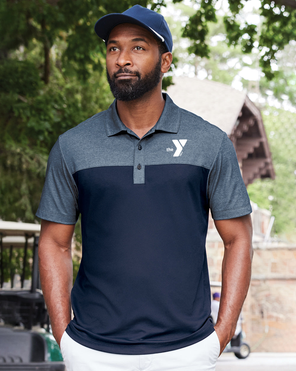
Started noticing stuff fast. That super clean, simple “Y” logo tee? People kept pointing at it. “That one.” “Yeah, the simple one.” Folks liked knowing it was the Y without some giant scream-y design. Color mattered too – navy blue, black, charcoal grey kept coming up. Bright red or yellow? Not so much.
Oh, and the hoodies! Thicker, pullover style ones with a nice pouch pocket? Big winner. Saw way more fingers tapping those photos. People liked ’em cozy and straightforward.
Totally Underestimated Some Things
Thought for sure the retro throwback shirts with the old-school script would be killer. Wrong. Most people just kinda glanced and moved on. “Bit much,” one guy said. Guess the vintage vibe wasn’t hitting like I thought.
Also figured folks would love options – like fancy prints or patterns. But nah. Solid colors ruled. People wanted the logo clear, the fit good, and nothing fussy.
Putting It All Together for the Team
Sat down with all my messy notes and scribbles. Basically made two piles:
- What People Liked: Simple logos front and center, solid dark colors, thick comfy hoodies, soft cotton tees.
- What Got Ignored: Super busy designs, loud flashy colors, cheap-feeling thin hoodies, heavy embroidery on workout stuff.
Showed the head coordinators the pictures people picked most. You could see it click – “Oh, so it’s really about the clean and comfy basics, not the fancy stuff.” That was the main takeaway, simple as that.
Honestly, it wasn’t rocket science, just actually asking and watching. Saved us from ordering a ton of stuff that probably woulda sat in boxes. People wear what they like, and they like what they feel good in. Keeping it simple and solid was the real winner.